- Role
- UX Designer
- Scope
- Healthcare
- Focus
- Healthcare
- Designer
 Gideon Awolesi
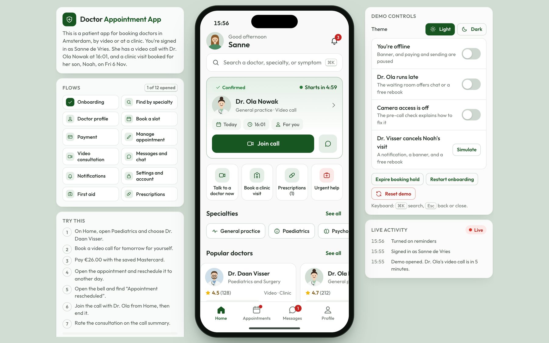
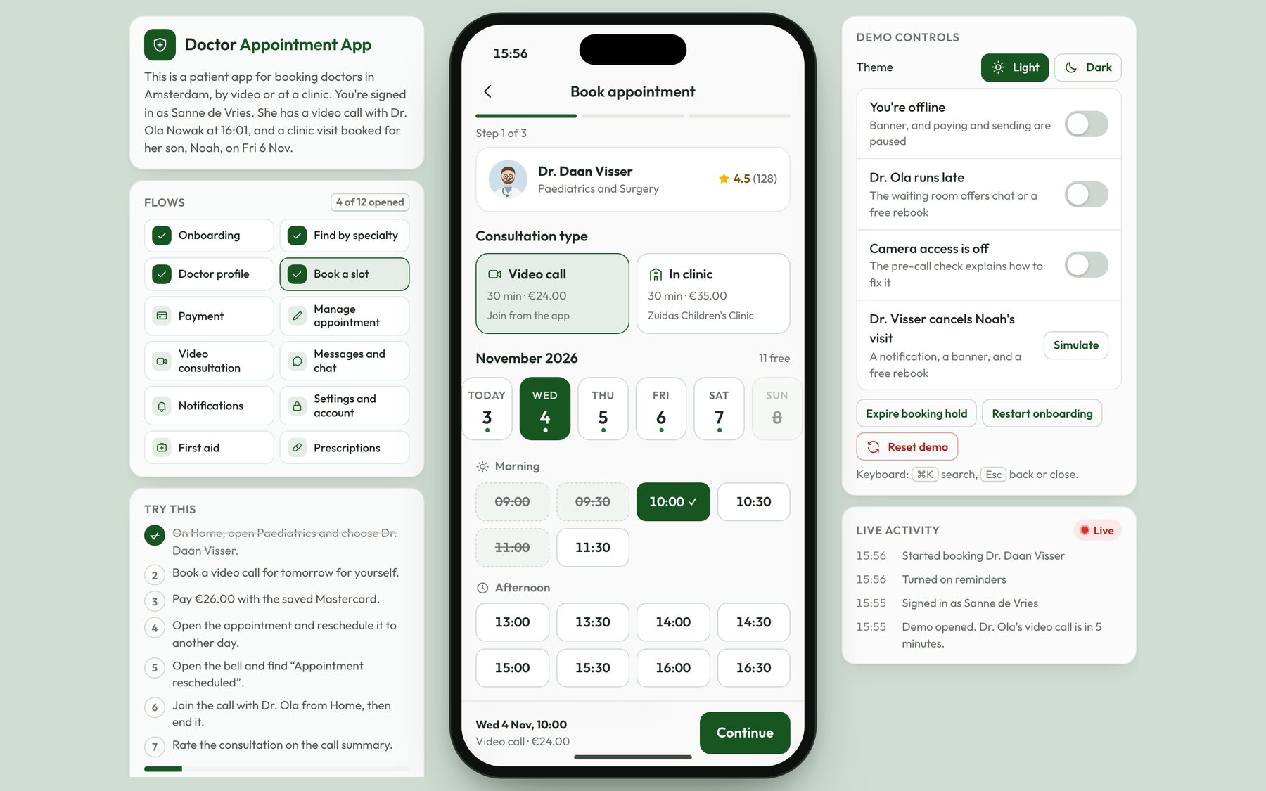
Clickable prototype
Open the redesigned Doctor Appointment App
Find a doctor by specialty, book and pay for a video call, then reschedule it from the Appointments tab. You can also join the call with Dr. Ola, end it, and read the prescription on the summary.
Overview
About the project
- Role: Product designer. I designed the Doctor Appointment App in Figma, from the greyscale wireframes to the high-fidelity mockups, and published it on Behance in March 2022. The idea came from my own experience of long waiting times in hospitals.
- What it is: The Doctor Appointment App is a patient app for online consultations and doctor appointments. You can find a doctor, book a time, pay in the app, and then see the doctor by video or message them. The original overview also promised first aid support and direct access to prescriptions.
- Outcome: The 2022 project was a set of 11 mobile screens, each one as a wireframe and as a high-fidelity mockup. In 2026, I went back to those designs and rebuilt the app as a clickable coded prototype in the same green brand, with the appointment management, video consultation, first aid, and prescription flows the original didn't have.
Prototype
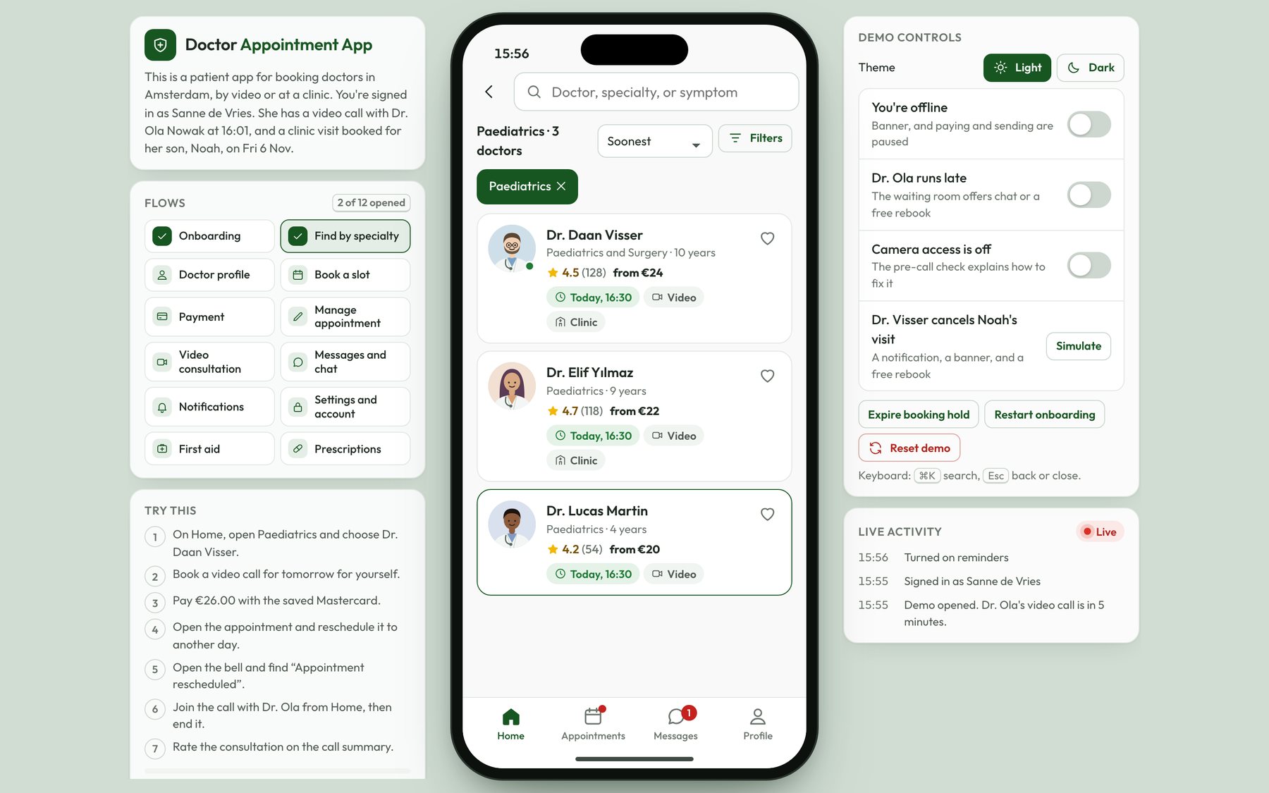
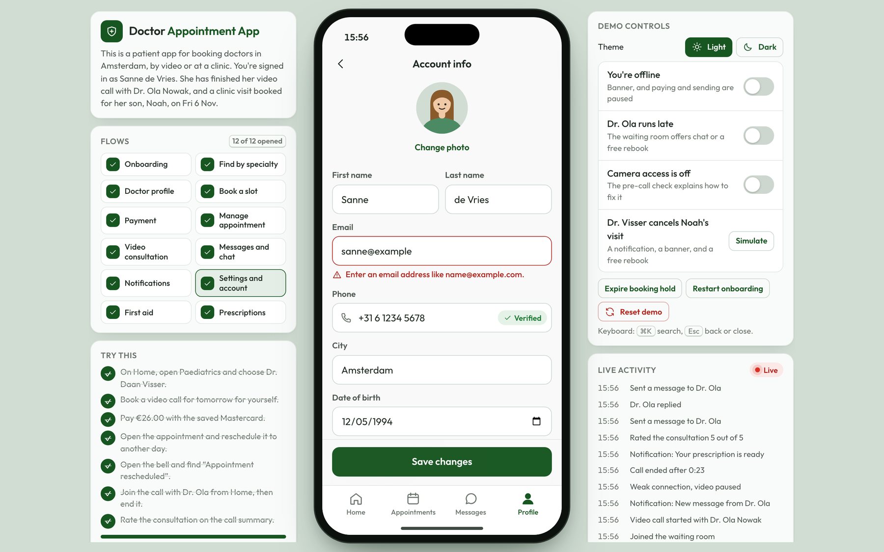
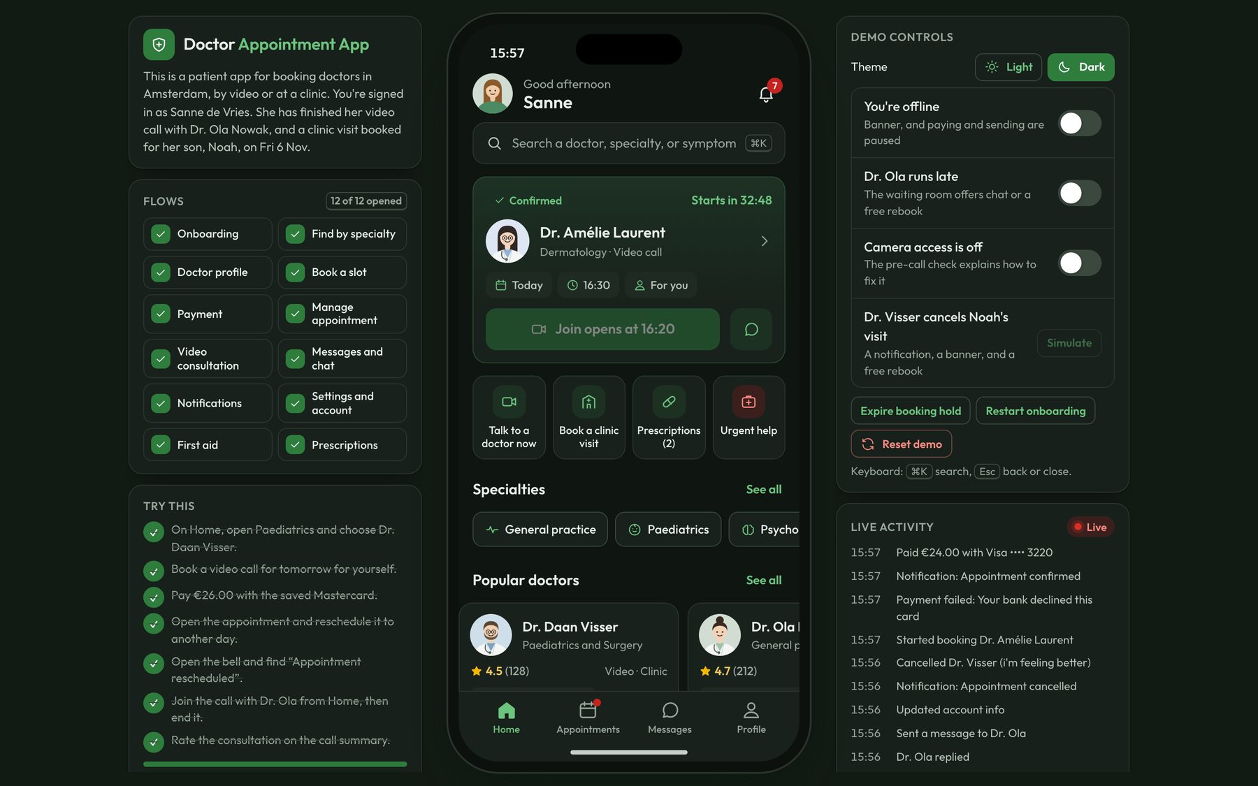
- Interactive prototype: /prototype/doctor-appointments/. The app is set in Amsterdam. You're signed in as Sanne de Vries, who has a video call with her GP in five minutes and a clinic visit booked for her son. You can find a doctor by specialty, book and pay for a consultation, change or cancel it, join the video call, and read the prescription afterwards. On a desktop, the panel next to the phone lists every flow and has switches to simulate errors, like being offline or a doctor who runs late.
- Try this: On Home, open Paediatrics and choose Dr. Daan Visser. Book a video call for tomorrow for yourself and pay €26.00 with the saved Mastercard. Then open the appointment, reschedule it to another day, and open the bell to find the “Appointment rescheduled” notification. After that, go back to Home, join the call with Dr. Ola, end it, and rate the consultation on the summary.
The product problem
The way it was at the time is that seeing a doctor meant going to a hospital or a clinic and waiting, often for hours, before anyone looked at you. For a headache that won't go away, the wait was the hardest part, and during the COVID pandemic, the waiting room was also a place where you could catch an infection.
So the problem I set out to solve was access. A patient should be able to reach the right doctor quickly, decide with that doctor if they need to come in at all, and get a prescription without sitting in a queue. That's several jobs in one app: finding a doctor by specialty, booking a time that works, paying, having the consultation, and keeping the prescription and the notes afterwards.
Research
- Methods: For the 2026 redesign, I ran 8 interviews with people who'd visited a clinic or hospital in the past six months, and a survey with 64 responses. I also reviewed five telehealth and appointment booking apps, booking the same kind of appointment in each one and noting every step. When the coded prototype was ready, I ran a moderated usability test with 6 participants.
- Participants: The interview group was 5 patients who book for themselves and 3 parents who book for their children. The survey was open to anyone who'd seen a doctor in the past year.
Key findings:
Waiting was the main complaint. 41 of the 64 survey respondents (64%) said they'd waited more than two hours at their last clinic visit, and the median wait they reported was 2 hours 40 minutes.
People wanted to know if they needed to come in at all. 6 of the 8 interviewees said they'd have been happy with a video consultation for their last visit. P3, a mother of two, said: “Half the time I just need someone to tell me if it's serious.”
The fee had to be clear before booking. 47 of the 64 respondents (73%) said they'd leave a booking flow if they couldn't see the fee before they picked a time.
Parents book for someone else. All 3 parents said the apps they'd tried assumed the patient was the account holder, so they had to type their child's details into a free text box.
Changing a booking was the gap in the apps I reviewed. In 3 of the 5 apps, I couldn't reschedule without cancelling and booking again, and only 2 of them showed the refund before I confirmed the cancellation.
In the usability test of the coded prototype, all 6 participants booked and paid for a video consultation without help, in a median time of 1 minute 52 seconds. 5 of the 6 rescheduled an appointment on their first try. The participant who didn't had looked for it on the doctor's profile, so I added a banner there with a link to the next appointment. The average SUS score was 84.
Users and jobs to be done
The main user is a patient booking for themselves. A second, important group is parents, who book for their children and need the appointment to be in the child's name.
When I feel unwell and I can't tell if it's serious, I want to reach a doctor quickly, so I can decide if I need to go to a clinic at all.
When I need a specific kind of doctor, I want to know who's free soon and what it costs, so I can book a time without waiting at the clinic.
When my plans change, I want to move or cancel the appointment myself and know what I'll get back, so I don't lose the money or the slot.
After the consultation, I want the doctor's notes and my prescription in one place, so I can buy the medicine and follow the instructions.
What I designed
In 2022, I designed the patient side of the app as 11 screens. I started with greyscale wireframes in Figma, and then I took each screen to a high-fidelity mockup in a deep green brand, with candid photography of patients and doctors.
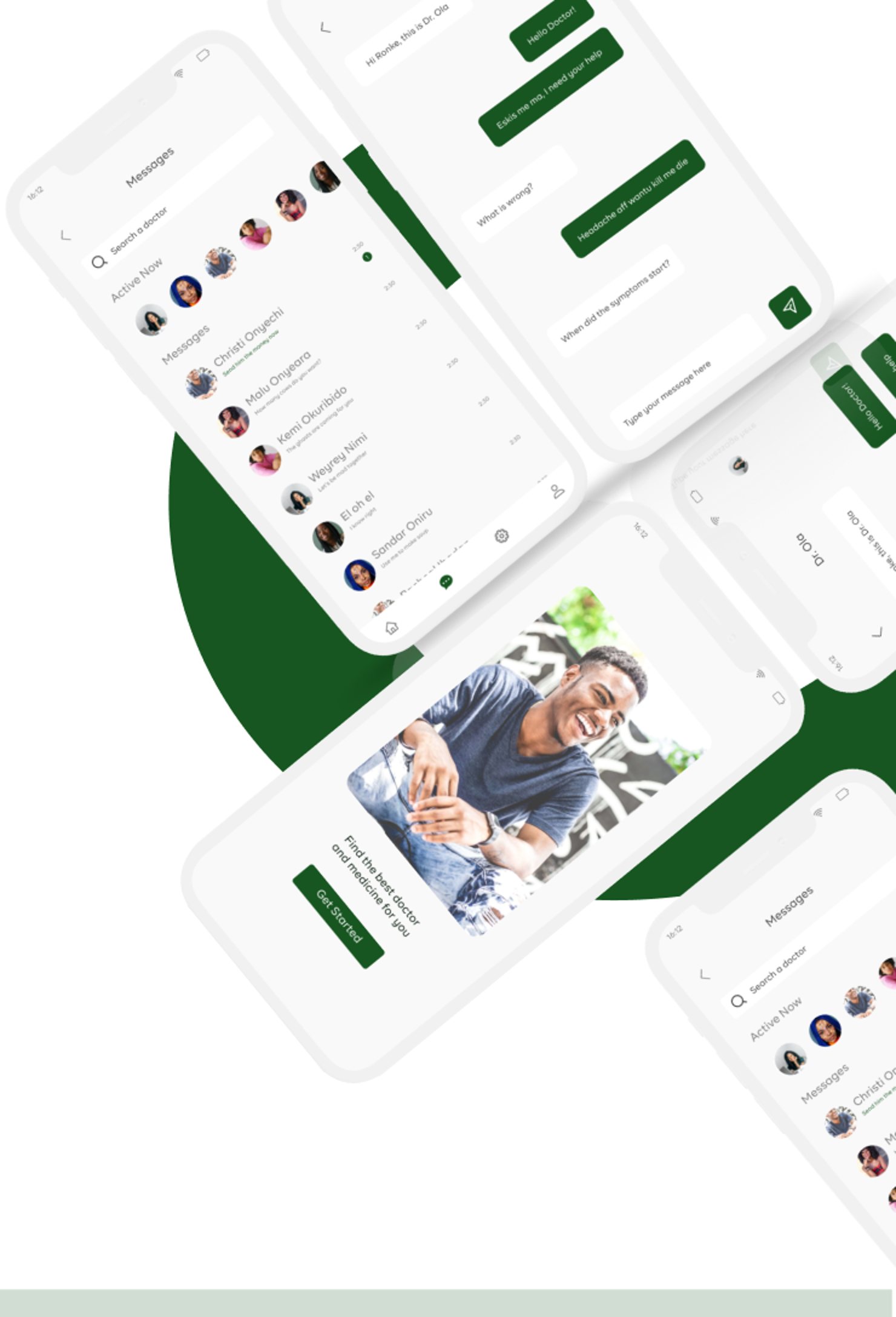
- Onboarding: A welcome screen with a photo, the line “Find the best doctor and medicine for you”, and a Get Started button.
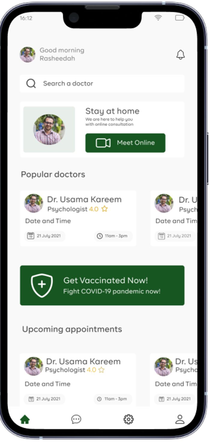
- Home: A greeting, a search bar for doctors, a Stay at home card with a Meet Online button, a row of popular doctors, a vaccination banner, and the patient's upcoming appointments.
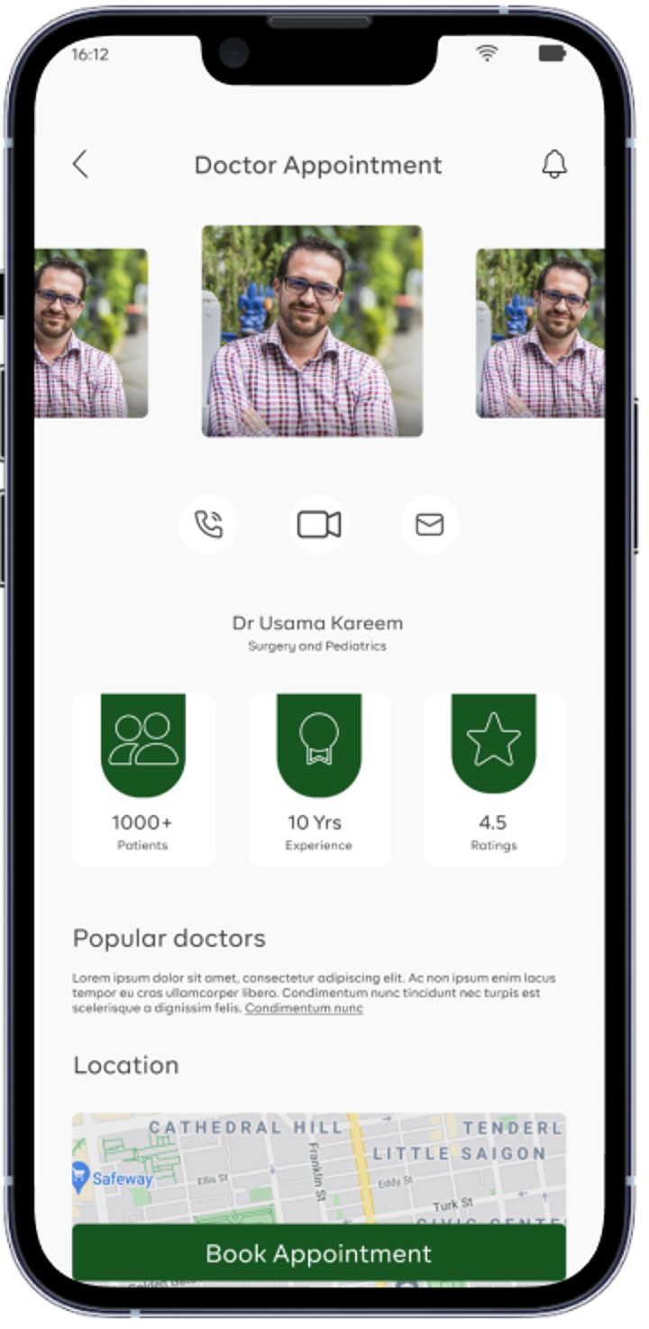
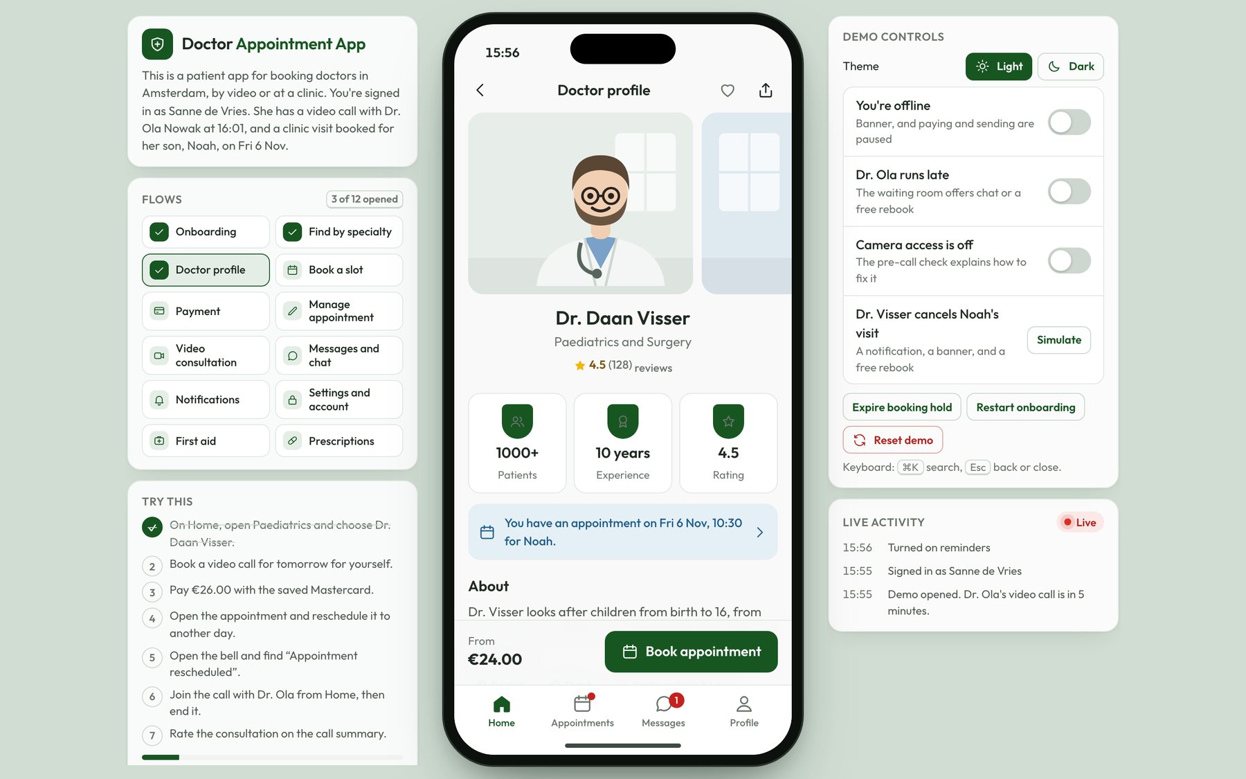
- Doctor profile: A photo carousel, the doctor's specialty, stat badges for patients seen, years of experience, and rating, a description, the clinic location on a map, and a Book Appointment button.
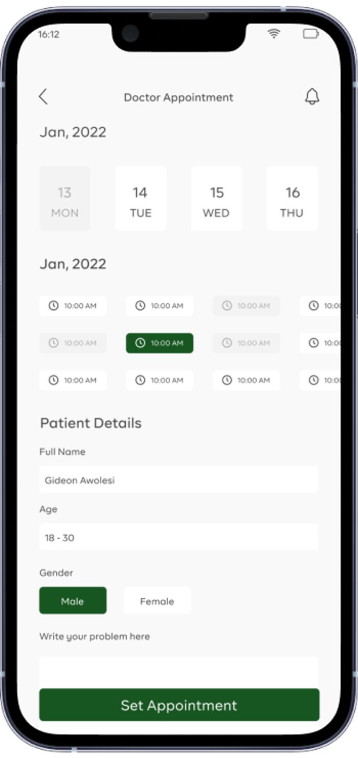
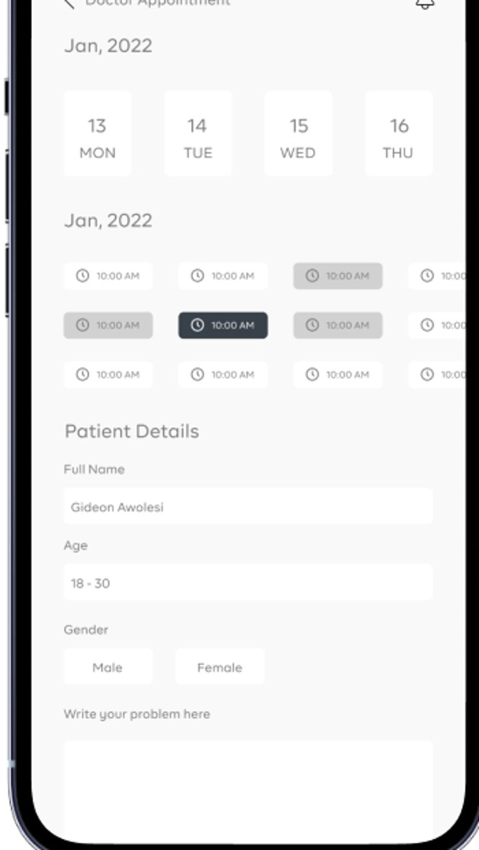
- Booking: A date and time picker, and a patient details form with the name, an age range, gender, and a box to describe the problem.
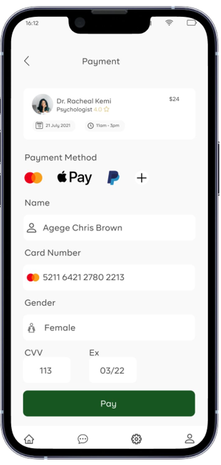
- Payment: A summary of the appointment with the fee, a choice of Mastercard, Apple Pay, or PayPal, and the card form.
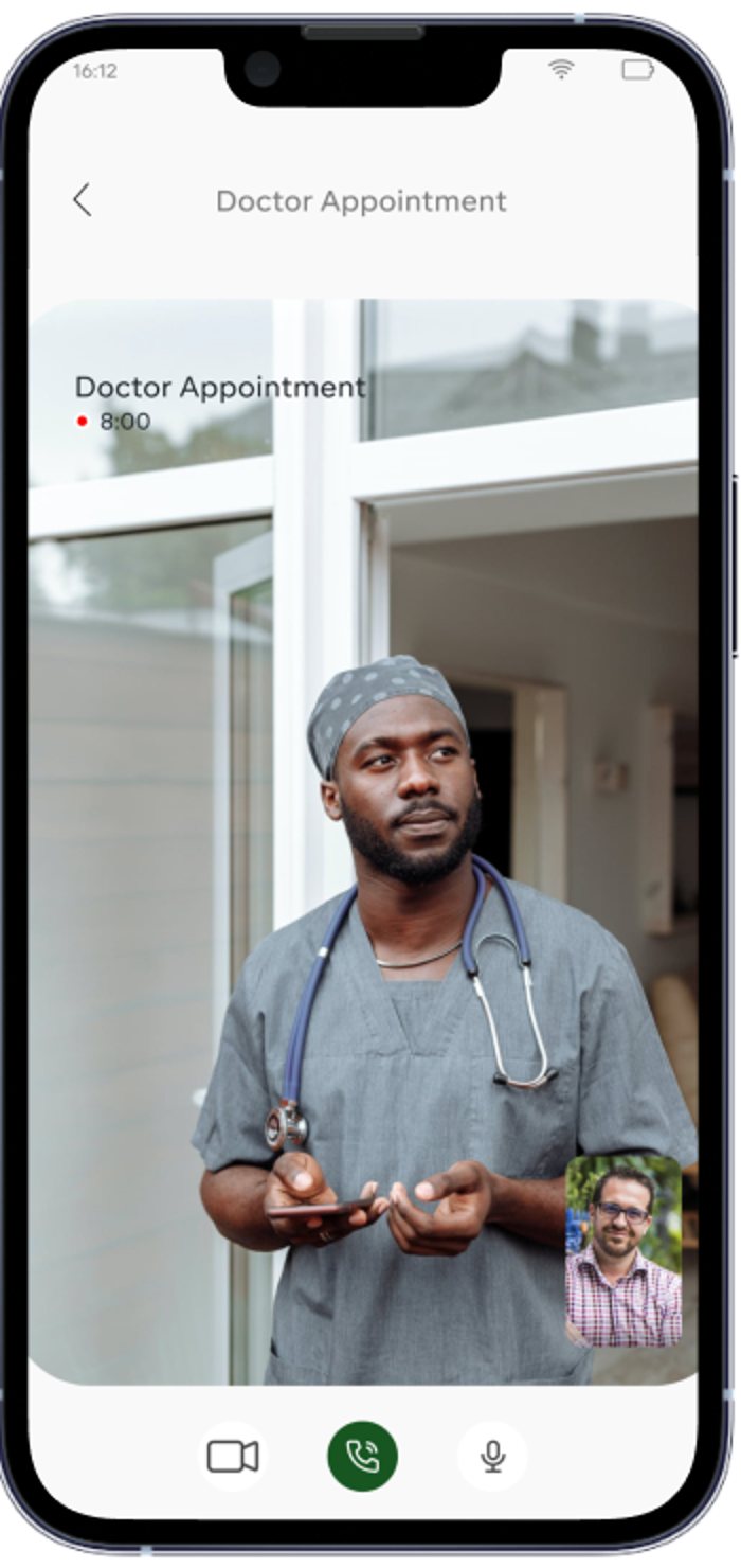
- Video call: A full-screen view of the doctor, a timer, a self view, and buttons for the camera, the call, and the microphone.
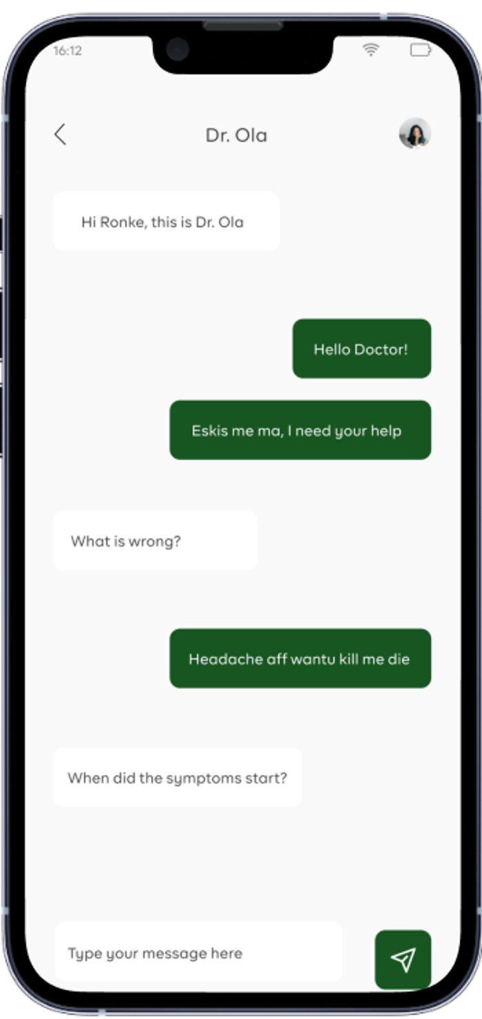
- Messages and chat: A list of conversations with the doctors who are active now at the top, and a chat thread with the doctor.
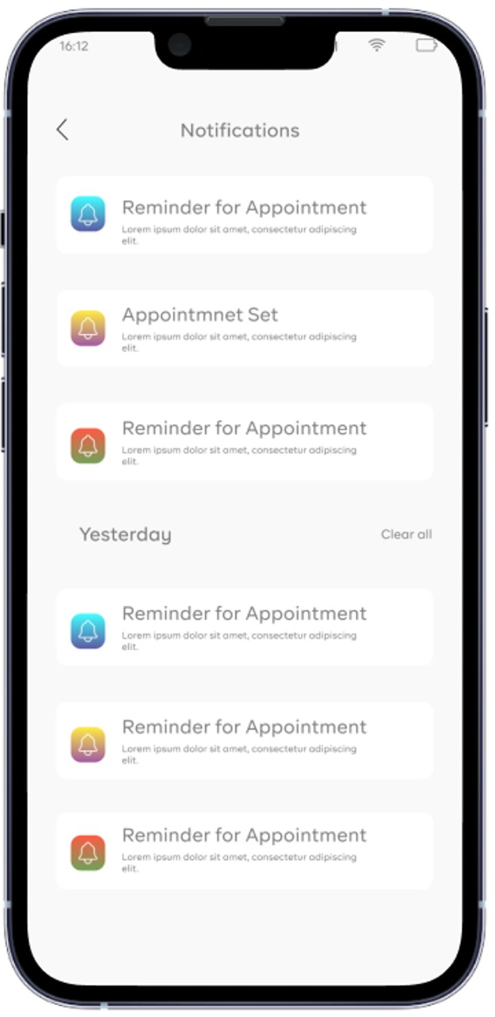
- Notifications, settings, and account info: Appointment reminders, a settings list, and the patient's profile.
How I redesigned it
In 2026, I rebuilt the app as a coded prototype. I kept the brand: the deep green for actions, the sage tint, the light grey and white surfaces, the thin outline icons, and the shield-shaped stat badges. Outfit replaces the original geometric typeface, because it's free to use on the web, and illustrated people replace the stock photos. I changed the interface and the interactions screen by screen.
- Setting: The sample content in the original was set in Lagos, with prices in US dollars. In the redesign, the app is set in Amsterdam. Prices are in euros, the clinics are in Amsterdam, Amstelveen, Haarlem, and Utrecht, and 112, the emergency number in every EU country, is on every screen where someone might need it.
- Text contrast and size: In the original mockups, the labels and titles were a light grey, and the smallest captions were about 8 points. That grey on white fails the WCAG AA contrast ratio, and on a phone in daylight it's hard to read. In the redesign, I darkened every text colour until it passes AA, and body text is 15 points. That's very important in a health app, because a lot of the people using it are unwell or older. The rating number was yellow on white, so it's now dark text next to a filled yellow star, with the review count.
- Finding a doctor by specialty: In the original, the only way to find a doctor was to type a name into the search bar, which assumes you already know who you want. In the redesign, there's a row of specialties on Home and a full grid behind See all. Each specialty opens a list of doctors you can sort by the soonest time, the rating, or the price, and filter by availability, consultation type, price, rating, language, and the doctor's sex. You can also search by symptom, so typing “headache” suggests general practice, and typing “chest pain” puts the emergency number above the results.
- Doctor cards: The original cards on Home showed a date and time from the past, which made a doctor you'd never seen look like a booked appointment. In the redesign, a doctor card shows the next free time and the fee, and only an appointment card shows a booked date. This way, the patient can compare doctors on the two things my survey respondents asked about first.
- Doctor profile: In the original profile, the description was headed “Popular doctors” and filled with placeholder text, and the phone, video, and mail buttons suggested you could call the doctor before booking. The same doctor also had a different specialty and rating on Home. In the redesign, every screen reads from one doctor record. The profile has an About section, the languages the doctor speaks, the consultation types with their prices, the next three free times, a clinic card with directions, and reviews. Booking is one sticky button at the bottom, and messaging opens once you have an appointment.
- Date and time picker: The original picker showed four days, repeated the month heading, and every slot read “10:00 AM”. Booked slots were only a lighter grey, which you can't tell apart without good colour vision. In the redesign, you scroll through 14 days, days the doctor doesn't work are crossed out with the reason, and the times are grouped into morning, afternoon, and evening. Booked times are struck through and labelled for screen readers, every chip is at least 44 points tall, and the picker shows your time zone. Other patients book times while you're on the screen, so a slot can disappear while you look at it, and the app shows a short message when that happens.
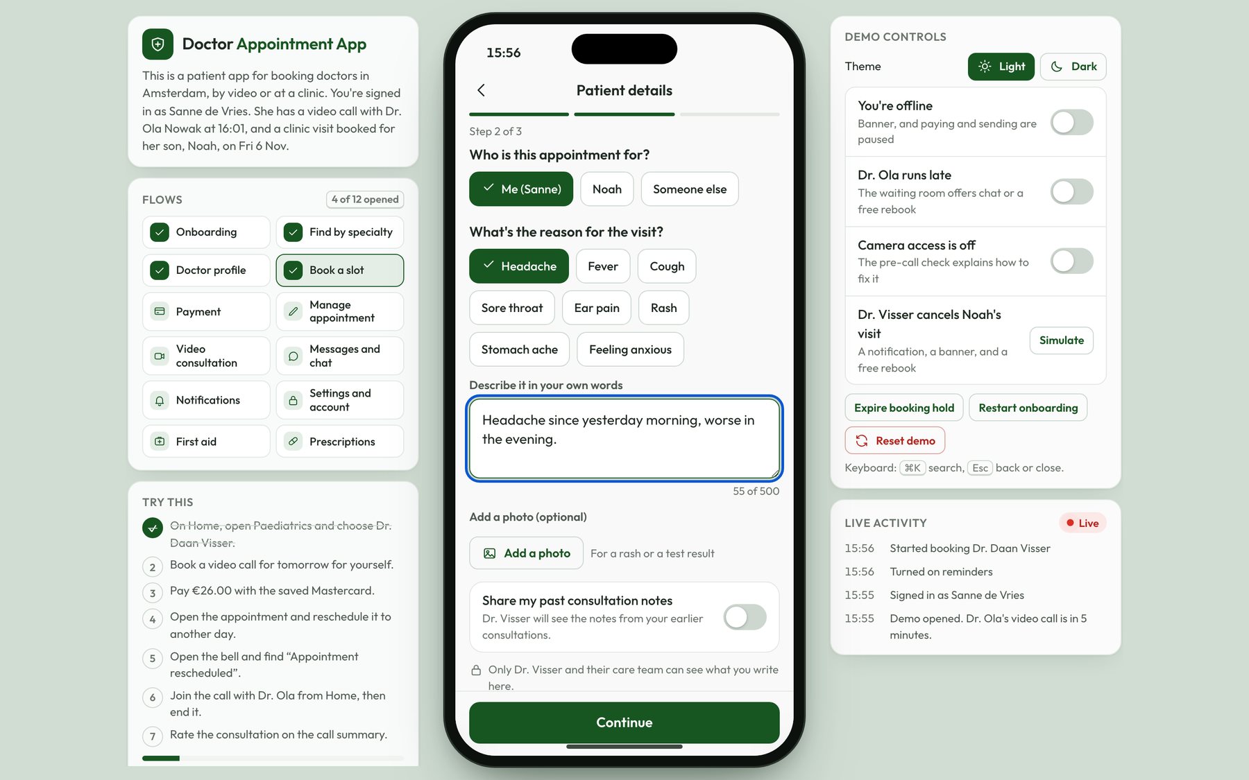
- Patient details: The original form asked for an age range and a binary gender, and it assumed the patient was the person holding the phone. In the redesign, the first question is who the appointment is for, so a parent can book for their child or add someone new. The reason for the visit has symptom chips as well as a text box with a hint, and you can add a photo, for a rash for instance. Past notes are only shared with the doctor if you switch that on.
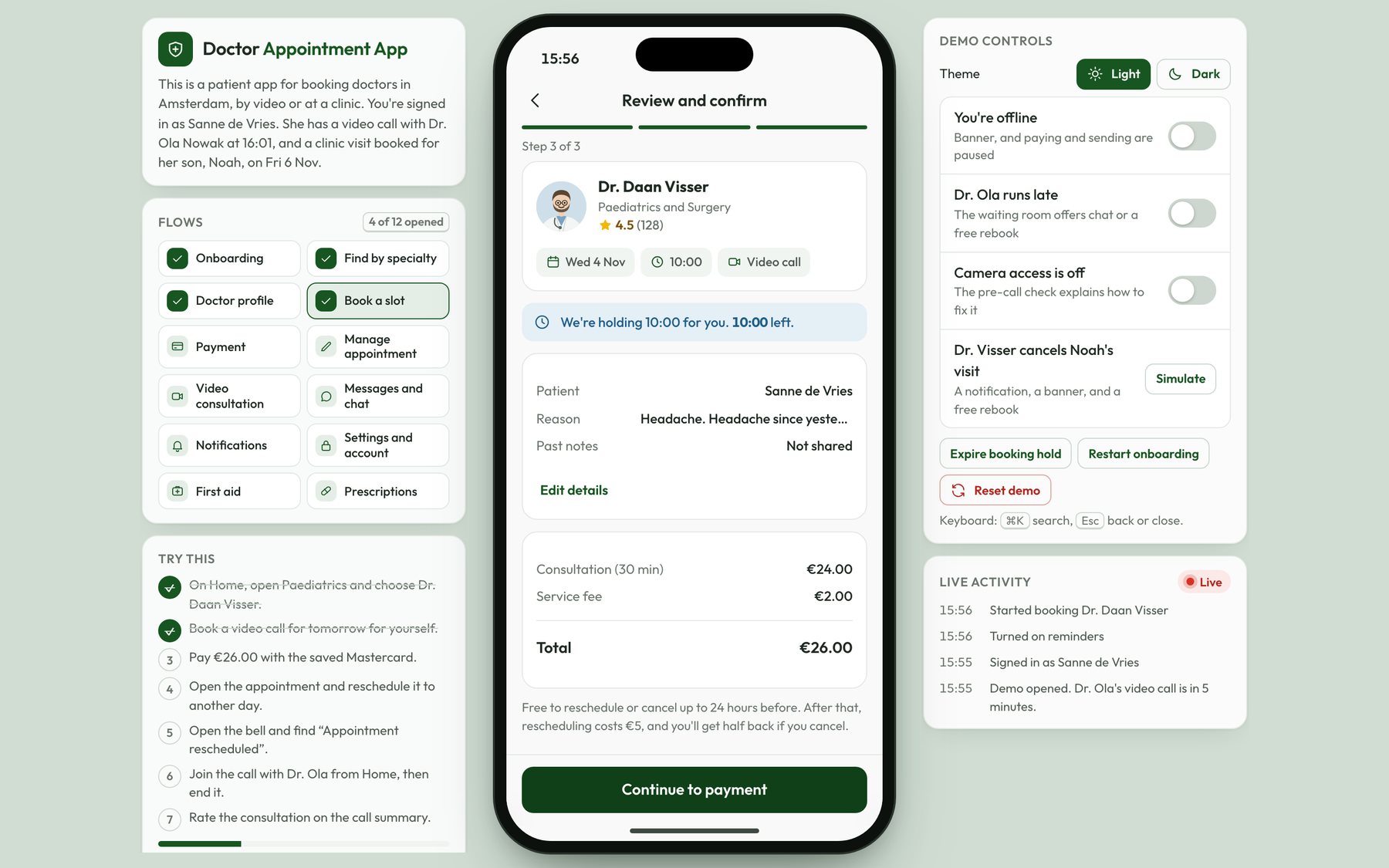
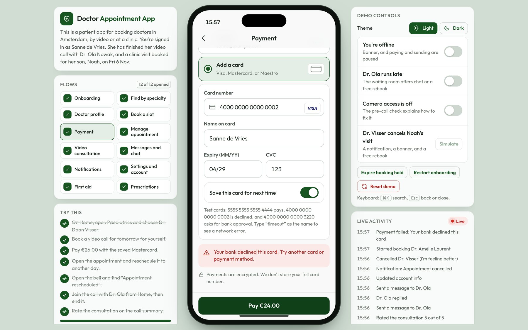
- Review and payment: In the original flow, Set Appointment went straight to a payment form that also asked for your gender. In the redesign, there's a review step with the fee, the service fee, and the cancellation policy before you pay, and the time is held for you for 10 minutes. The payment form only asks for what a card needs, saved cards are masked, and the Pay button shows the total. If your bank declines the card, or you have to approve the payment in your bank app, you'll get a message above the Pay button with what happened and what to do next. You can then pick another method without losing the booking.
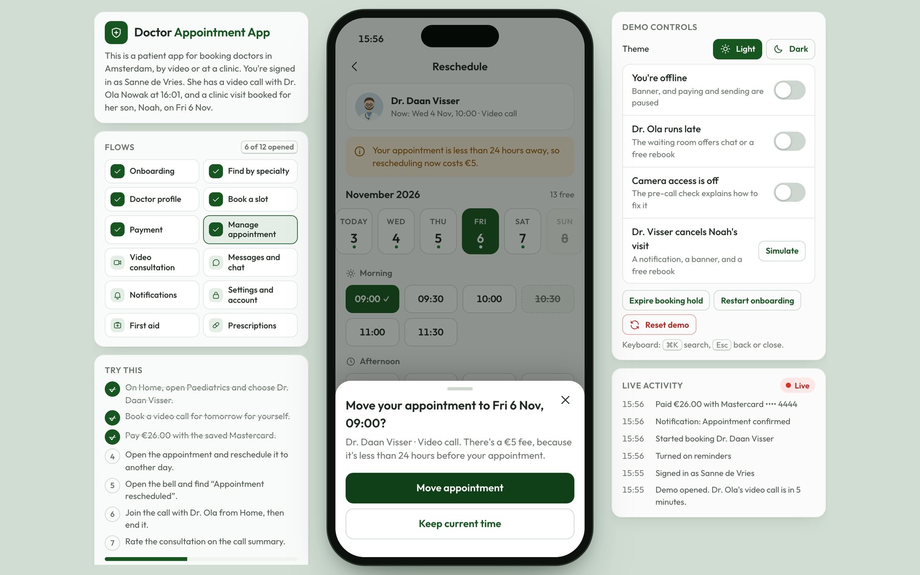
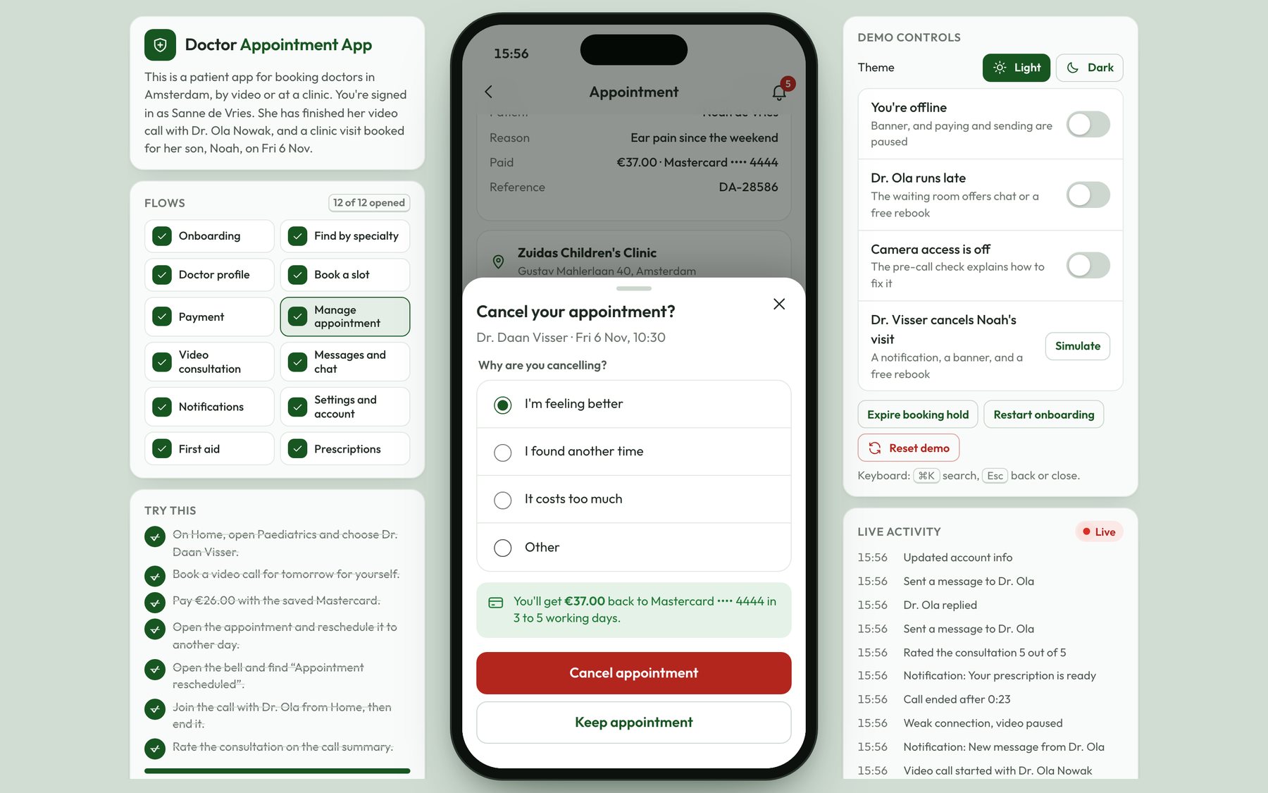
- Managing appointments: The original design didn't include a list of your appointments or a way to change one. In the redesign, an Appointments tab replaces Settings in the tab bar, with upcoming, past, and cancelled appointments. From an appointment, you can join the call, message the doctor, reschedule, cancel, add it to your calendar, or open the receipt. Before you confirm a cancellation, you can read how much you'll get back and to which card, and inside 24 hours that's half the fee. If the doctor cancels, you get a full refund and a button to rebook for free.
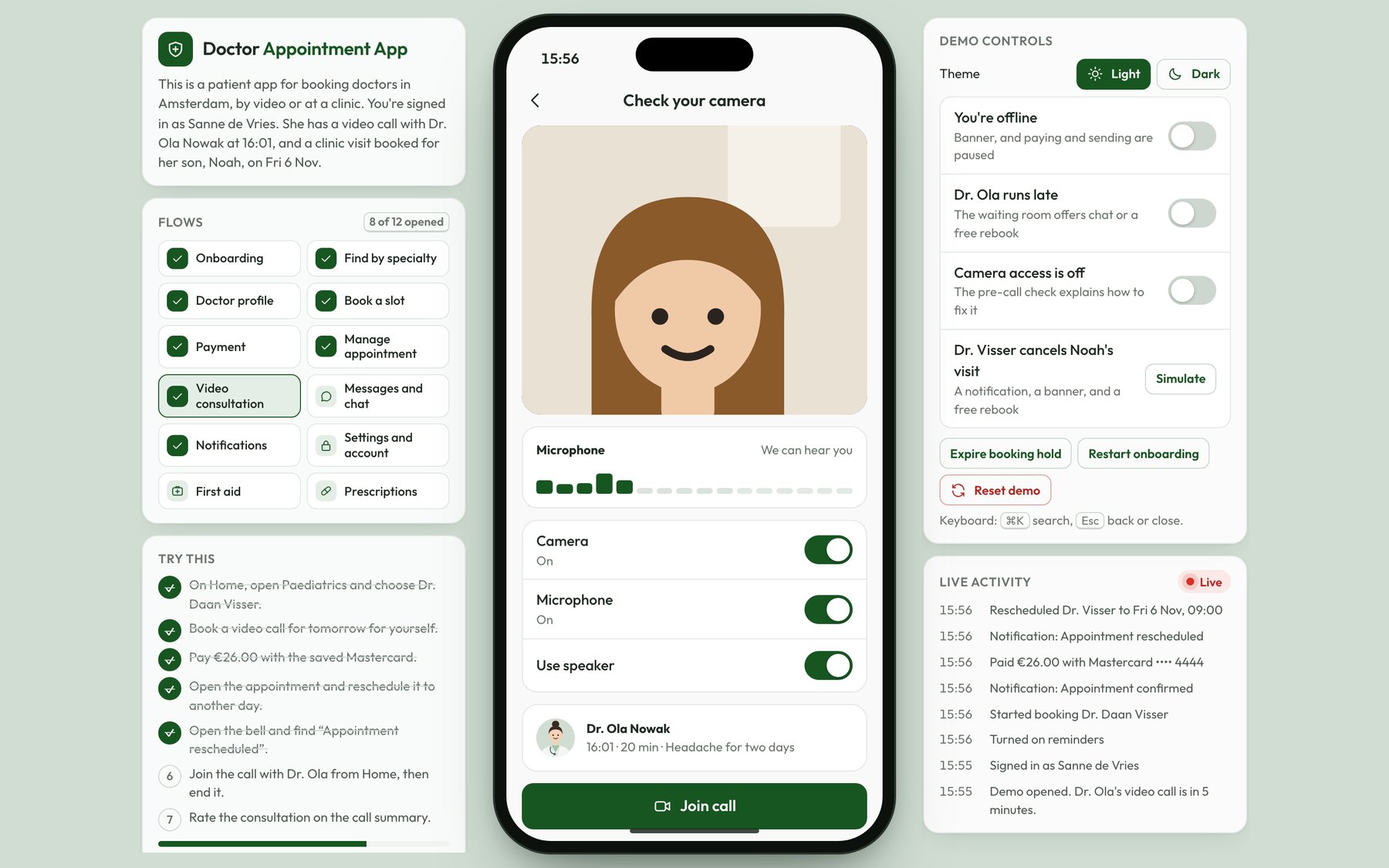
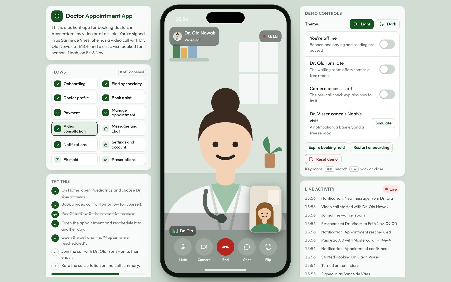
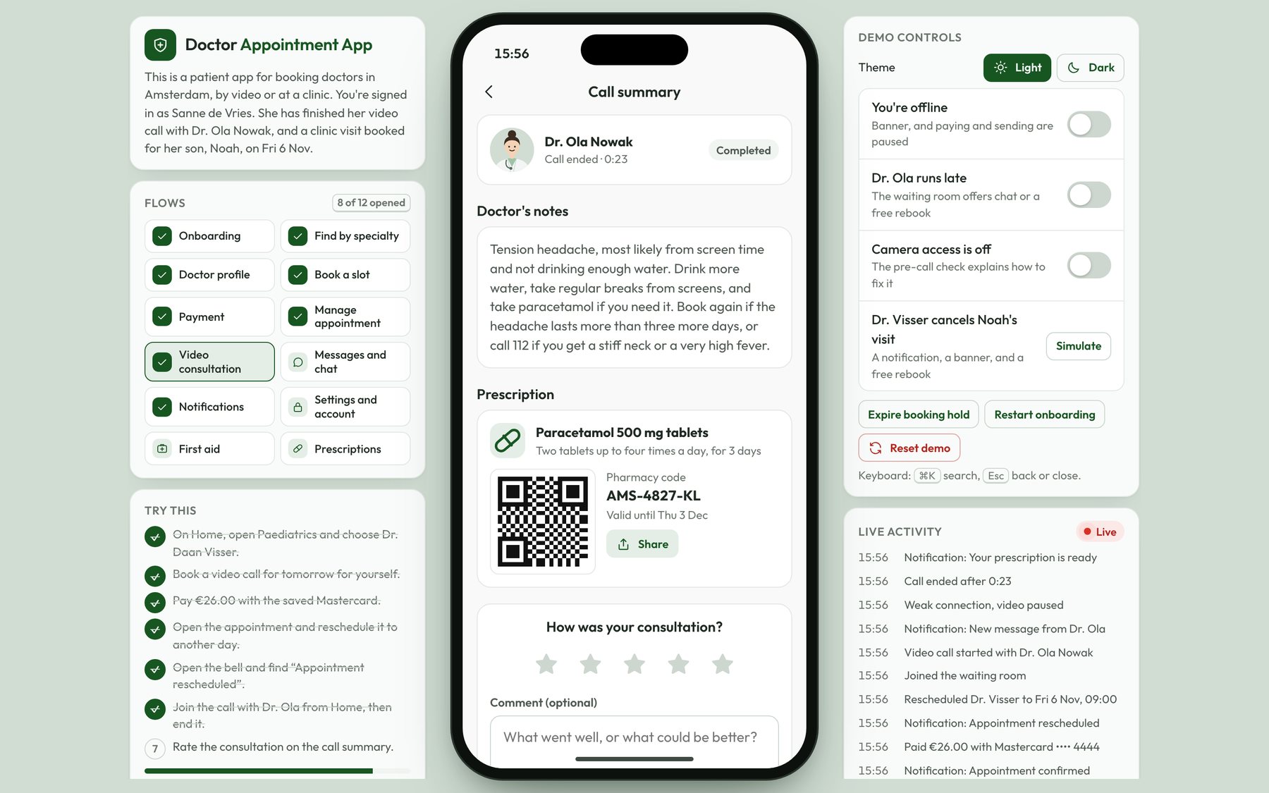
- The video consultation: The original call screen had a timer and three buttons, with no clear way to end the call. In the redesign, there's a camera and microphone check before you join, and a waiting room until the doctor arrives. In the call, the End button is red, every control has a label, and you can drag your own video to any corner. If your connection is weak, the video pauses while the audio carries on, and a banner at the top of the call shows that. After the call, you get a summary with the doctor's notes and your prescription, and you can rate the consultation or book a follow-up.
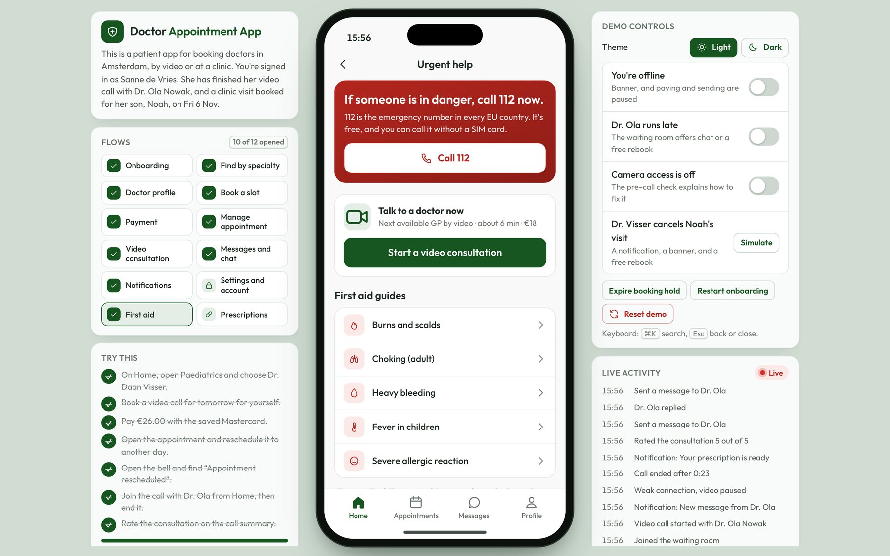
- Urgent help and first aid: The original overview promised first aid support, but no screen covered it. In the redesign, Urgent help is one tap from Home. It has a button to call 112, a video consultation with the next available GP, and short first aid guides for burns, choking, heavy bleeding, fever in children, and severe allergic reactions.
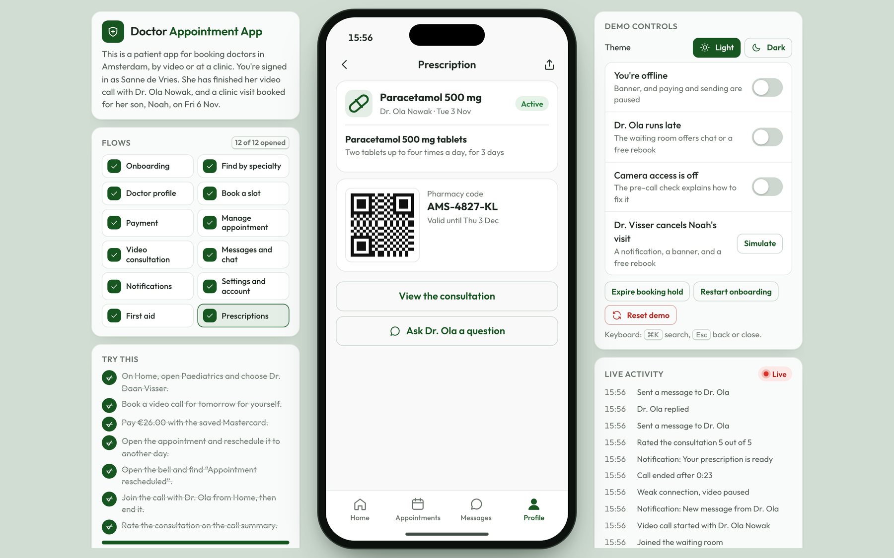
- Prescriptions: The original overview also promised direct access to prescriptions, and that wasn't designed either. In the redesign, the prescription is on the call summary as soon as the doctor adds it, with a pharmacy code you show at the counter. Profile has a list of active and expired prescriptions, the pharmacies near you, and a button to ask for a repeat prescription.
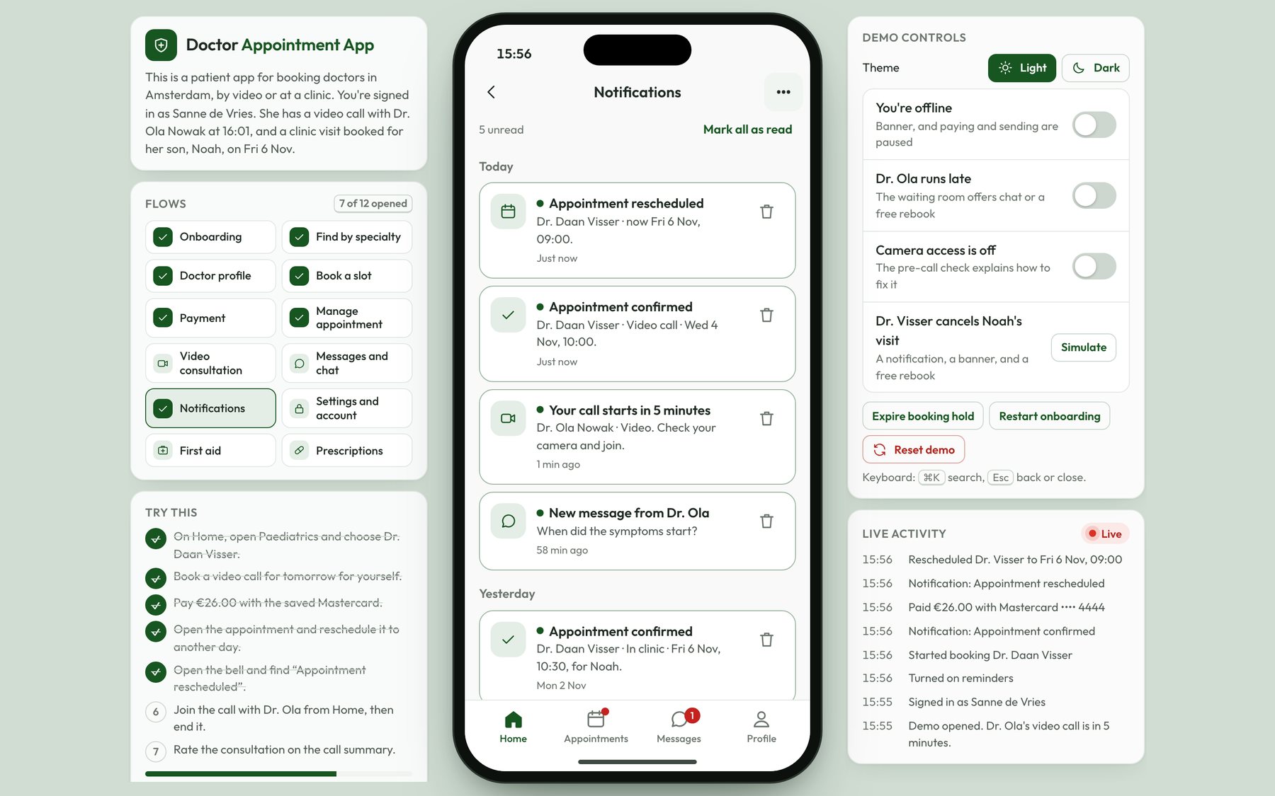
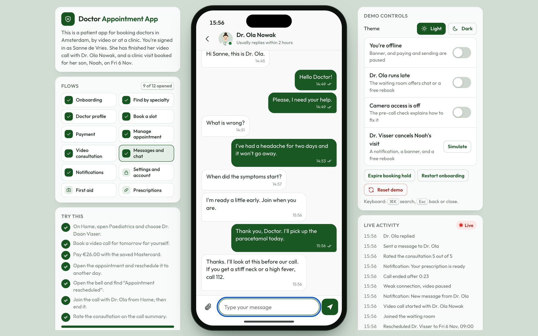
- Notifications and messages: The original notifications used placeholder text and the same title five times, with rainbow icons that didn't match the brand. In the redesign, each notification type has its own wording and a green icon, unread ones have a dot, and tapping one opens the appointment or the message it's about. You can delete one and undo it, or clear them all. The chat now has delivery ticks, a typing indicator, a retry for failed messages, and a fixed line with the emergency number, because a chat with a doctor isn't the right place for an emergency.
- Settings and account: In the original, the account screen saved your profile with a button labelled Set Appointment. In the redesign, Settings moves into Profile. Account info has inline validation and a Save changes button that's disabled until you change something, and Profile also has family members, payment methods, notification settings, security, and dark mode.
Impact
The 2022 work was 11 screens, each as a wireframe and a mockup, published on Behance. The 2026 prototype is my own redesign, and it runs on sample data. It now covers the patient journey from finding a doctor by specialty to the prescription after the call, and you can try every step of it on this page.
In the usability test of the coded prototype, all 6 participants booked and paid for a consultation without help, in a median of 1 minute 52 seconds, and the average SUS score was 84.
Need this level of detail in your product?
Work through the hard product decisions early.
If you’re a product team, that can mean a focused design, system, or prototype project. If you’re hiring, it’s a chance to look closer at how I work across research, interfaces, and code.