Syndigo · Commerce
Syndigo: Design System and Design-to-Code
Rebuilt a fragmented enterprise design system as one governed component library connected to production code.
- Role
- Senior Manager, UX Design
- Scope
- Product-data design system and design-to-code pipeline
- Focus
- Commerce
- Designer
 Gideon Awolesi
My contribution · Syndigo
Product-data design system and design-to-code pipeline
The work focused on component governance, shared review between design and engineering, and a prototyping workflow built on the real product components instead of generic placeholders.
- 70+
- components consolidated
- 1
- governed component library
- UI Relay
- Figma plugin
What I owned
- 01Audited duplicate components across products and consolidated them into approved patterns.
- 02Connected Figma components to Storybook so design and implementation could be reviewed together.
- 03Managed designers and configured AI prototyping to use the real product components.


Overview
About the project
Project overview
- Role: Former Senior Manager, UX Design at Syndigo.
- Solution: A single code-connected design system across Syndigo’s product suite. It replaced the duplicated component libraries and linked the approved components to Storybook, GitHub, and the company’s AI prototyping tools.
- Objective: Give designers, frontend engineers, and product managers the same components to work from, so there was less drift between Figma and production and the accessibility requirements stayed visible. My role covered three areas:
Leading product design for core products, including the Nutrition Analysis platform and Syndication Tracker, and supervising the designer who worked with me.
Rebuilding a fragmented design system as one governed library connected to production code.
Partnering with the VP of Design, the Director of Design, and frontend engineering on design-system governance and delivery.
Design process
The audit told me what needed to change and in what order.
- Audit: I inventoried every component across the products, mapped Figma against production, and flagged every duplicate and inconsistency.
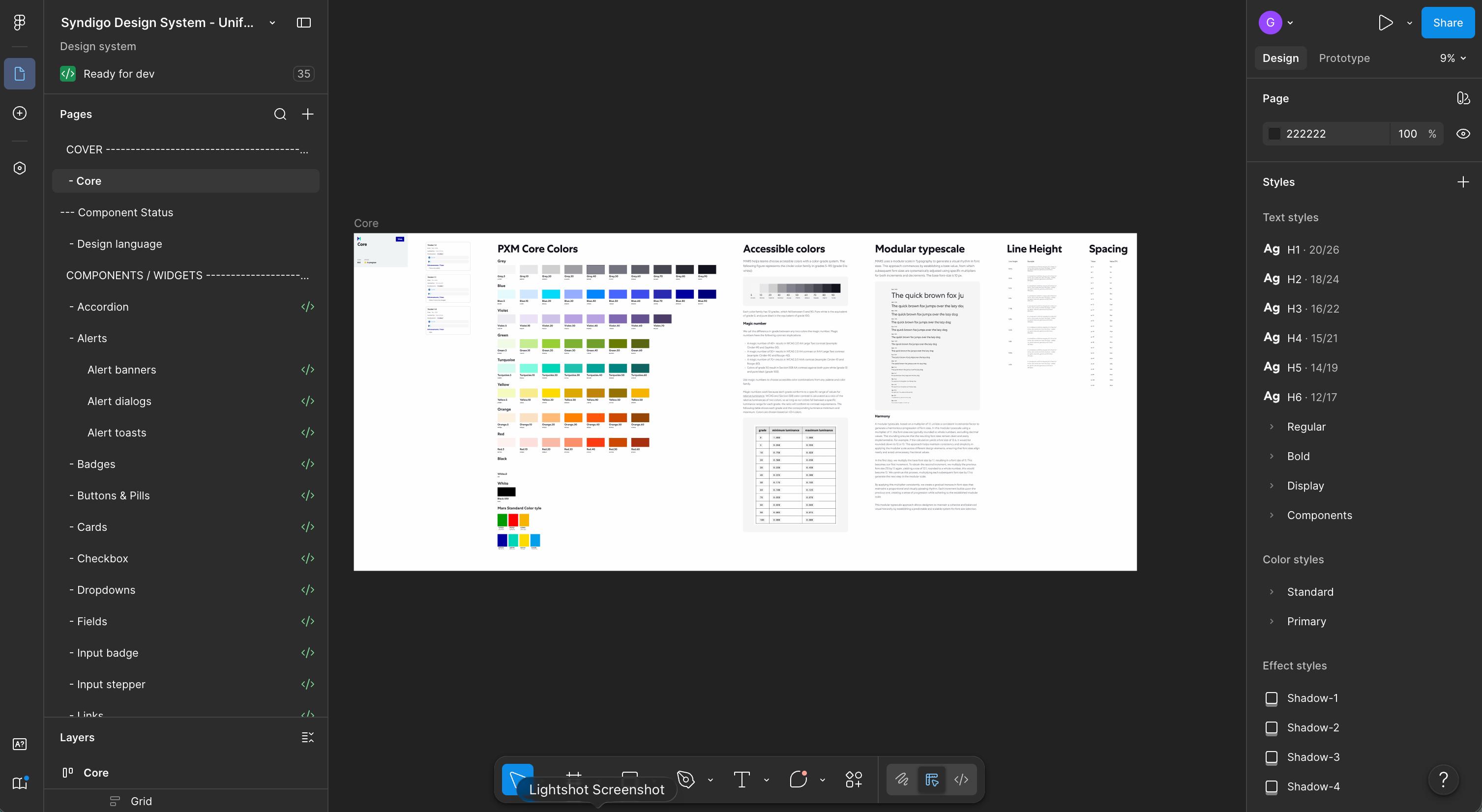
- Consolidation: I reduced each set of duplicates to one canonical component and documented its anatomy, variants, and version history. Each design frame also showed if the work was in ideation, in progress, or complete, and had the relevant ticket attached.
- Code Connect and Storybook: I wrote the Code Connect and component files for more than 70 components. In Storybook, you could see the design and the coded component side by side.
- Repository work: Engineering gave me access to the codebase, where I maintained the component and Code Connect files directly.
- Coded prototypes: I introduced Figma MCP to turn designs into clickable prototypes before development. I also configured Lovable and Claude Design to use the approved components, so anything they generated stayed within the system.
- Accessibility: I built semantic structure, labels, and implementation guidance into the components, so the accessibility requirements could still be reviewed during design and delivery.
Accessibility
The components used semantic structure, ARIA roles, and clear labels. They came with representative screen-reader checks and written guidance for teams extending the system, and information didn’t rely on colour alone. This case study does not claim a universal conformance level.
Impact metrics
I consolidated 70+ components into a single code-connected source of truth.
Syndigo got its first design-to-engineering pipeline, and coded prototypes let us test designs before development.
Product and design teams adopted component-based prototyping through Lovable and Claude Design.
Because the components were connected to code, designers and frontend engineers repeated less work.
Context and problem statement
The design system didn’t have a clear structure, and there was very little governance. The same component often existed in several inconsistent versions across products, and nothing connected design to shipped code. There wasn’t a Storybook, the components weren’t connected to code, and UX had no presence in GitHub.
Designers, engineers, and product managers each read the system differently. Delivery slowed down because engineers kept rebuilding interface patterns from inconsistent specifications.
Stakeholder analysis
- Frontend engineers: They needed components that matched the approved design and could go into production without another round of interpretation.
- Product designers: They needed one governed component kit, so they could spend their time on product problems instead of recreating common interface elements.
- Product managers: They needed to test ideas quickly with prototypes that still matched the real product.
System audit
I started by looking at how teams were actually using the existing system, in Figma and in production.
- Component inventory: I catalogued the components in use and identified duplicates.
- Figma-to-production mapping: I compared the design libraries with the shipped interfaces to find where the two had drifted apart.
- Team interviews: I spoke with designers and engineers about where the system helped and where they had to work around it.
- UI Relay Figma plugin: I built a Figma plugin that maps components to code, tracks coverage and code health, generates and syncs component code, manages tokens and templates, and flags gaps. With it, keeping the system maintained became part of the team’s normal workflow.
Challenges and solutions
Design and code weren’t connected. I got access to the repository and maintained the Code Connect and component files myself, so approved design decisions could reach production without anyone having to interpret them again.
The library was also fragmented. I consolidated the duplicate patterns and built the UI Relay plugin to catch drift whenever new work came into the system.
To get teams to adopt it, I connected the system to coded prototypes, Lovable, and Claude Design. That way, teams could keep using the tools they preferred and still work with the approved components.


Need this level of detail in your product?
Work through the hard product decisions early.
If you’re a product team, that can mean a focused design, system, or prototype project. If you’re hiring, it’s a chance to look closer at how I work across research, interfaces, and code.