Euler · Web
Euler: DeFi Lending and Borrowing
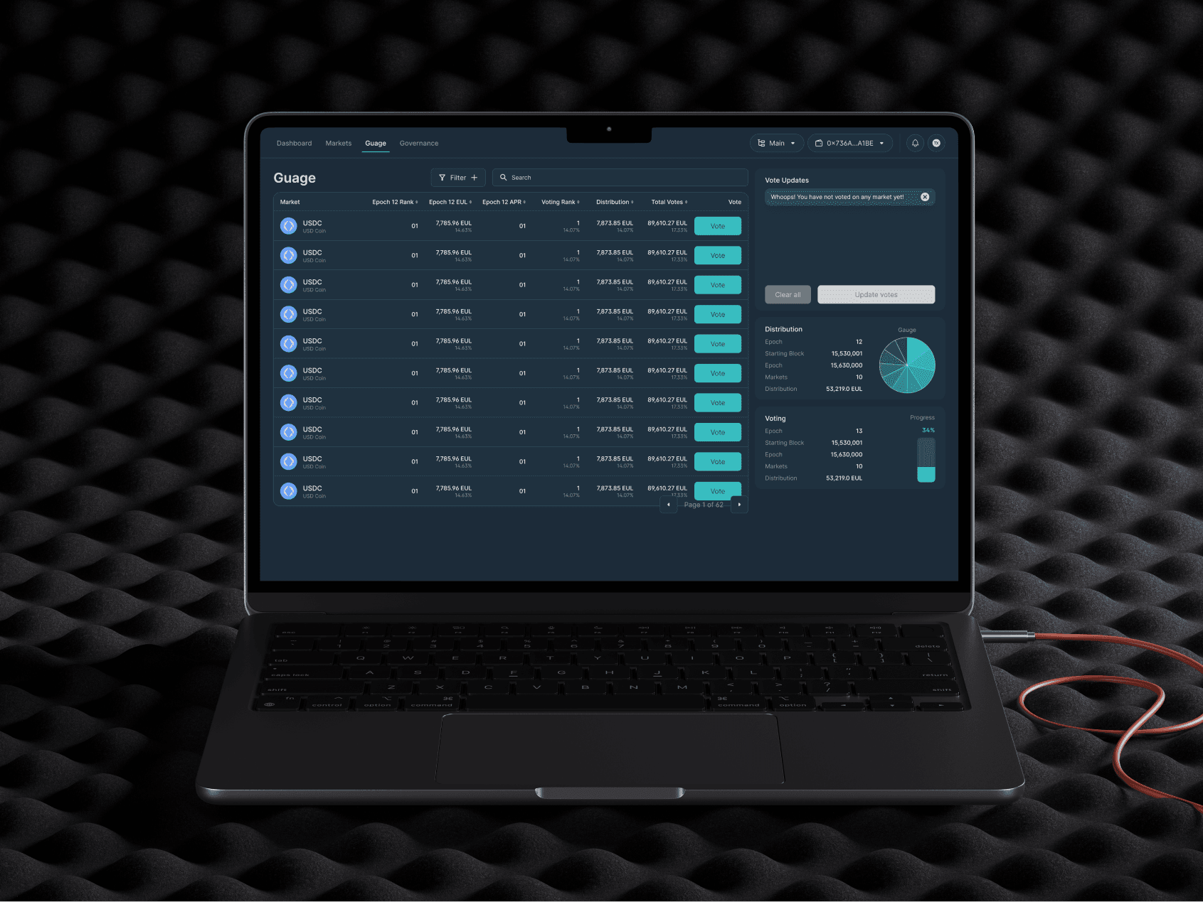
Led research, usability analysis and interface design for DeFi lending and borrowing across wallet, market, transaction and mobile flows.
- Role
- Senior UX Designer / Research Lead
- Scope
- DeFi lending and borrowing experience
- Focus
- Web
- Designer
 Gideon Awolesi
My contribution · Euler
DeFi lending and borrowing experience
I used the research to simplify decisions around collateral, risk, and completion, then tested the lending and borrowing flows on desktop and mobile.
- 12
- interviews
- 200+
- survey responses
- 2
- usability-test rounds
What I owned
- 01Ran research and workshops to identify where DeFi users dropped off.
- 02Simplified lending and borrowing decisions around risk, collateral and completion.
- 03Made transaction states clearer on desktop and mobile.


Overview
About the project
- Role: Senior UX Designer and Research Lead.
- Platform: Euler, a DeFi lending and borrowing protocol.
- Objective: Make onboarding, market selection, risk review, and transaction completion easier to understand.
- Team and timeline: I worked for six months with two product managers, four engineers, and one QA specialist.
Problem statement
Users were leaving the product because the lending and borrowing flows were hard to understand and hard to complete.
Goals and success metrics
I started with a team workshop to agree on the research questions, the problem statement, and the measures we’d use to judge the work.
- Onboarding: Google Analytics showed a lot of users leaving early, so we focused on the questions and decisions that stopped new users from getting started.
- Transaction completion: Some users who got past the landing page still dropped off during the core lending and borrowing flow.
- Retention: With the marketing team, we set a target of increasing returning weekly active users by 10%.
That way, product, design, and engineering all measured progress the same way.
From wireframes to prototype
- Low-fidelity wireframes: I mapped onboarding, lending, borrowing, and loan management, and paid particular attention to navigation and the order of information.
- Mid-fidelity designs: I added the visual system and placed explanations beside unfamiliar DeFi terms and decisions.
- High-fidelity prototype: I built the main flows in Figma and added contextual guidance. The community asked for a dark theme, so I included one.
The first round of testing showed that the mobile inputs were cramped and the top navigation was overloaded. Before the next prototype review, I made the tap areas bigger and simplified the navigation.
Two rounds of usability testing
- Round one: Eight participants went through moderated remote sessions with the first design. I tested navigation, clarity, and trust signals.
- Round two: I revised the tooltips and data displays, and then compared a detailed layout with a simpler version.
User feedback: “The new interface is so much easier to navigate—it finally feels like I’m in control of my funds, rather than the interface controlling me.”
Kickoff and user research
First, I needed to understand where newer and experienced DeFi users read risk differently, and where both groups got stuck.
I ran 12 interviews with newer and experienced DeFi users. We also ran two online surveys and got responses from more than 200 people we recruited through the project’s Discord community.
Partners with a large financial stake in the protocol also joined individual interviews, so the research heard from everyday users and from high-value participants.
Reviewing each stage of the flow
I led workshops with product and engineering where we went through each stage, from the landing page to loan repayment.
Proposed solutions
- Onboarding: Explanations appeared the first time a user came across an unfamiliar feature. Tooltips covered DeFi terms, security warnings, and transaction fees.
- Dashboard modes: Newer users could choose a simpler view, while experienced users could keep the additional data they needed.
- Risk information: Liquidity risk and loan-to-value changes showed up inside the decision flow, and confirmation messages appeared wherever a transaction changed state.
Storyboards and low-fidelity wireframes let the team test these ideas before we spent time on detailed screens.
What the validation showed
- Validation: The revised flow made onboarding, lending, and borrowing decisions easier to explain and test.
- Onboarding: Contextual help and progressive disclosure dealt with the early confusion we’d seen in the analytics and research.
- Transactions: Risk, collateral, and confirmation states appeared before the user committed to the transaction.
This case study documents the research and design validation. It does not claim that the redesign caused Euler’s current protocol metrics.


Need this level of detail in your product?
Work through the hard product decisions early.
If you’re a product team, that can mean a focused design, system, or prototype project. If you’re hiring, it’s a chance to look closer at how I work across research, interfaces, and code.